Instashop Website
Online grocery shopping with delivery, featuring a high-end, quality-first, health-conscious experience
PRoject details
Challenge: Instashop has an 8% decrease in annual market sales over four years due to rival grocery stores offering an online experience for shopping and delivery.
Goal: Expand their customer base and grow market shares by offering customers an online platform to buy groceries. To set themselves apart, Instashop hopes to appeal to the high-end, health-conscious consumer.
CONTRIBUTION
User Research
Competitive Analysis
Persona Development
Task Analysis
Information Architecture
Branding
Visual Design
Wireframes
Usability Studies
High Fidelity Mockups
TOOLS USED
Pen and Paper
Sketch
Illustrator
Photoshop
Verify
Marvel
Invision
overview
The online grocery shopping market shows promising growth for the future, and Instashop, a conceptual brick and morter grocery store, plans to enter this growing market as a major contender. By launching an online shopping experience to remain competitive, they hope to addresses the 8% decrease in annual market sales.
PROCESS
To better understand the market and its users, multiple research methodologies were used to answer key questions and generate important insights. Research in this early stage helped to define clear goals on how best to introduce the product to the public, where Instashop belongs in the market and to fully focus on the consumer. This method allows further review of the online grocery shopping industry itself, as well as collecting demographic information and defining the user needs/wants/beliefs concerning the product.
I followed the framework of Design Thinking: 1) understand, 2) explore, and 3) materialize. To help analyze and organize, the framework is broken down into six phases: empathize, define, ideate, prototype, test and implement.
EMPATHIZE

ONLINE SURVEy
I wanted to begin my research by focusing on user behaviors and finding the target audience. The brief, 10-question survey was a great starting point and provided insightful feedback.
MAJORITY FINDINGS
- Primarily female user, aged 30-39
- Have never shopped for groceries online
- Those who do shop online, enjoy the convenience of not leaving home and avoiding crowds
- There is concern for quality and selection of products
IN-PERSON INTERVIEWS
Next, I personally interviewed four participants about their shopping habits, feelings and preferences regarding in-store grocery shopping and online grocery shopping.
Majority Findings
Navigating a large store and standing in line is considered inefficient, waste of time
Crowds are distracting and annoying
Quality of food is not guaranteed
Availability of quality health food is not guaranteed
“Buying groceries at Whole Foods is typically a great experience for me. I trust the quality of the food, the selection is better and geared towards my health needs...and it just feels luxurious.”
DEFINE

Patterns in the user data showed three overlapping needs when shopping for groceries: 1) The need to focus on a task with limited distractions, such as shopping with their children and typical grocery store crowds, 2) high quality of products and 3) the need for efficient systems. Based on these needs, I created "Ceri Reynolds" for a chance to step outside of myself and recognize her needs and expectation.
IDEATE

Keeping the unmet user needs at the forefront, I wanted to create a variety of options to solve problems. Here I was able to explore the site structure, typical user flow and branding – all the while, being intentional with information gathered from research.
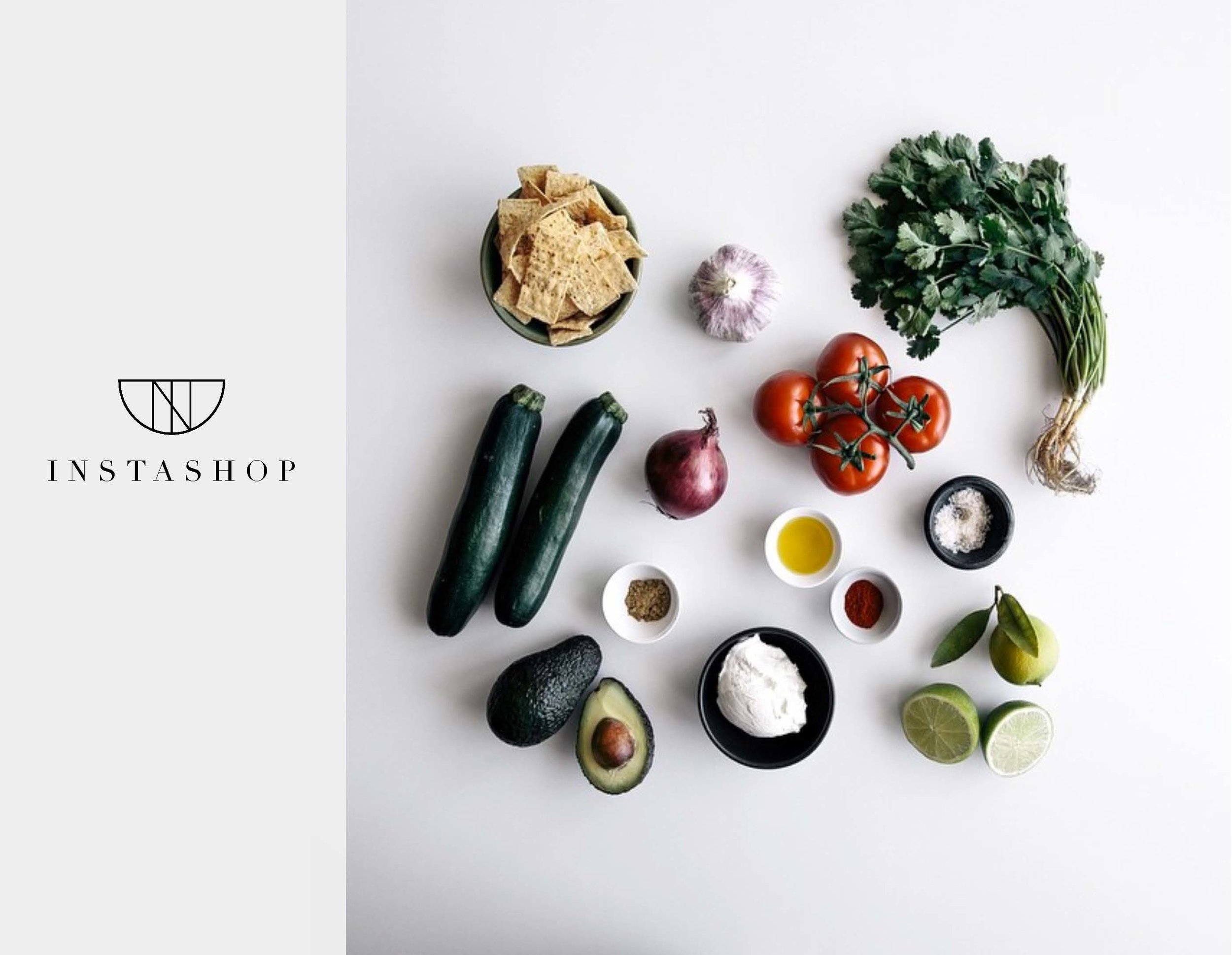
mood board
Creating a high-end, luxury feel was my driving force when creating the mood board. I wanted to explore highly curated food photography that gave an organic, high quality feel. Simple, monotone colors and shades for the brand can help to let the food images to demand attention.


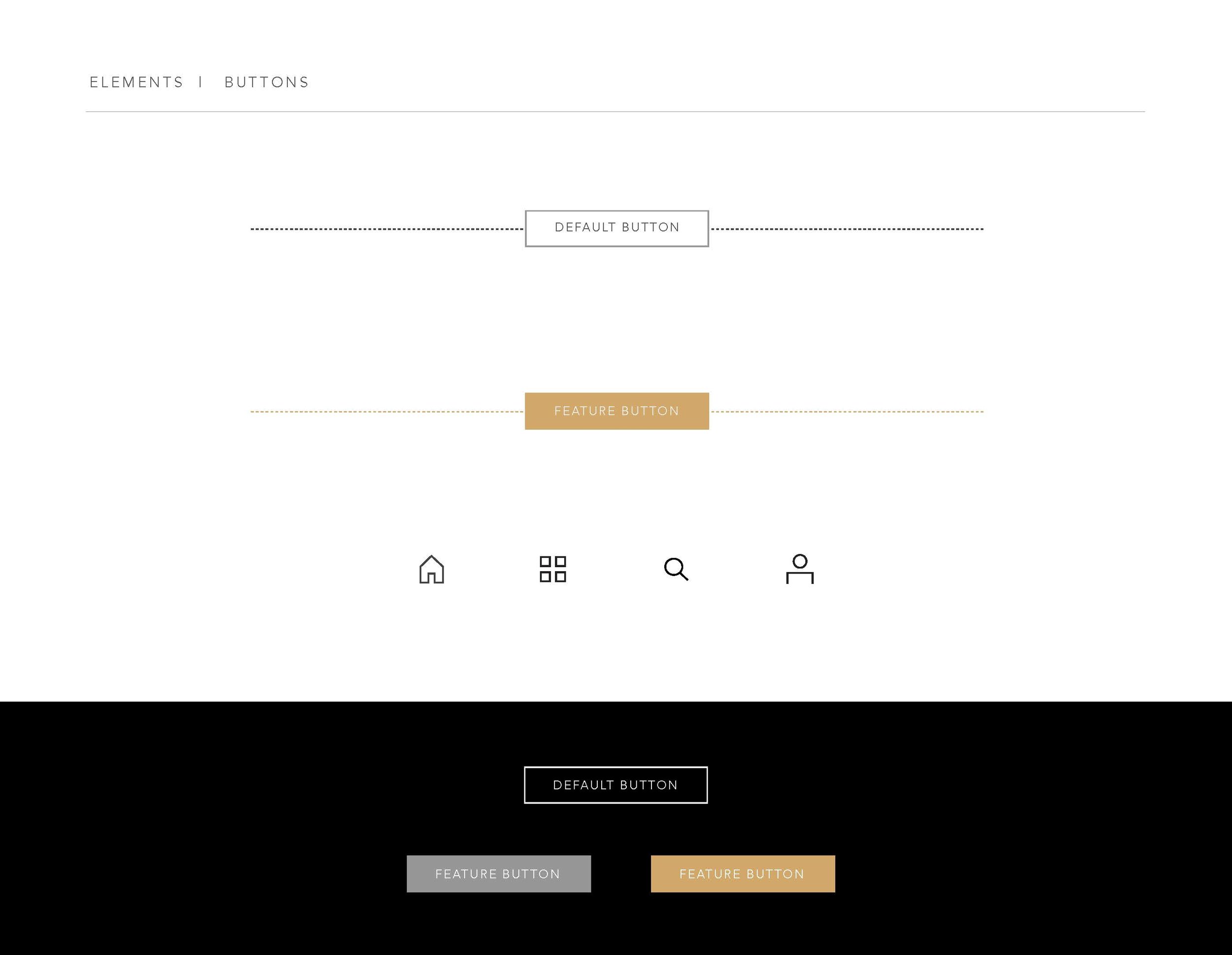
BRANDING
Since the user feedback showed an interest in high quality products with a high-end feel, I focused on typefaces, colors and designs that communicated that. Research of luxury brands showed an abundance of white space, simple typefaces, modern/graphic elements and an overall minimal look. Sketching and graphic elements were explored first, then the strongest designs were refined with color options.
LOGO EXPLORATION
BRAND STYLE TILE


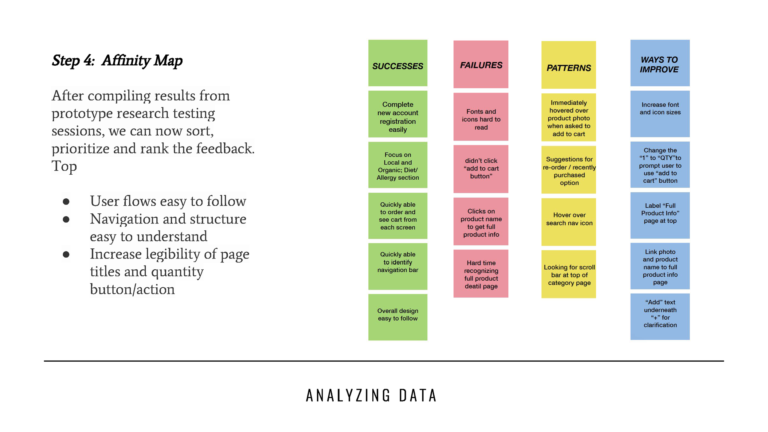
PROTOTYPE

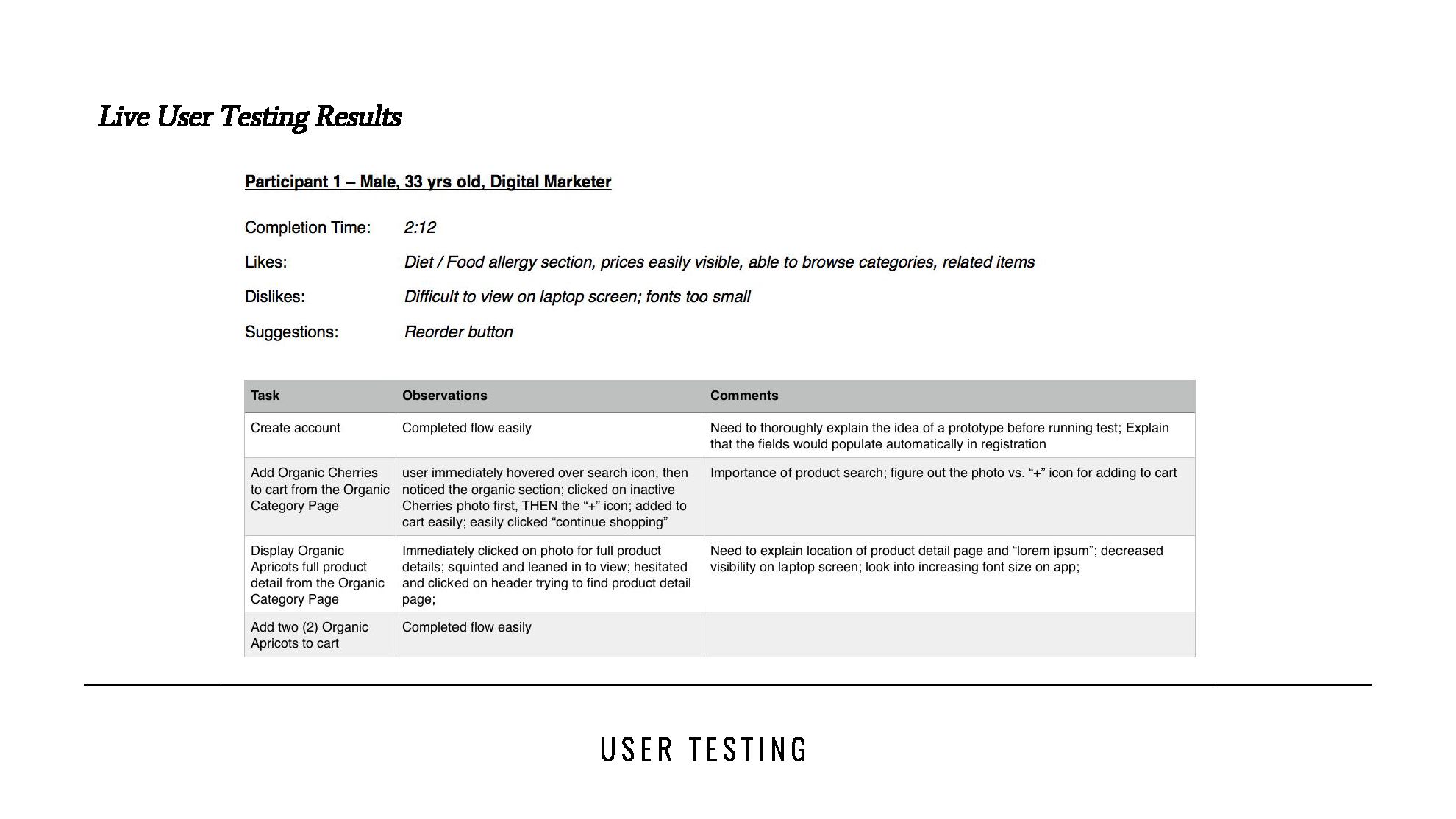
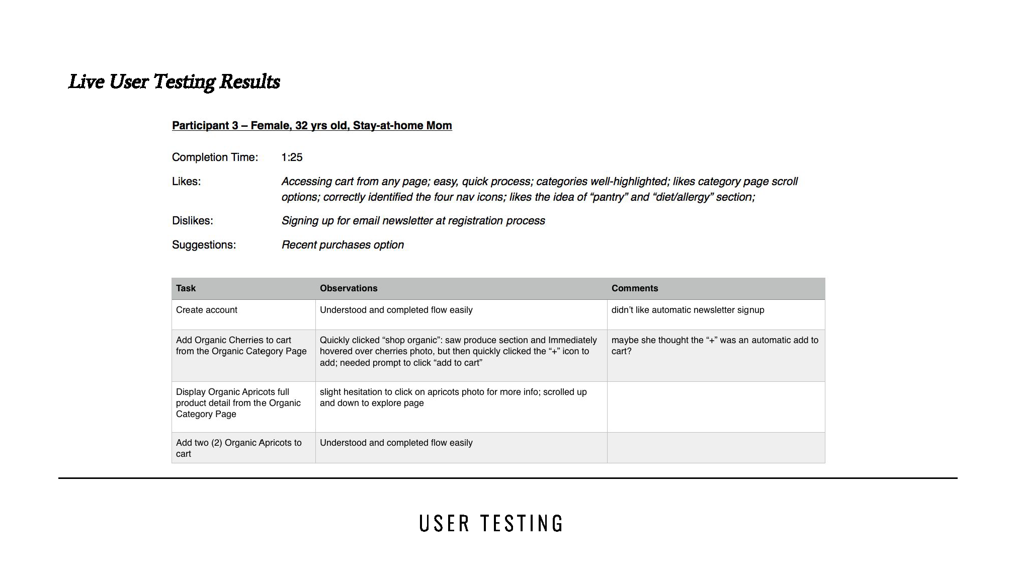
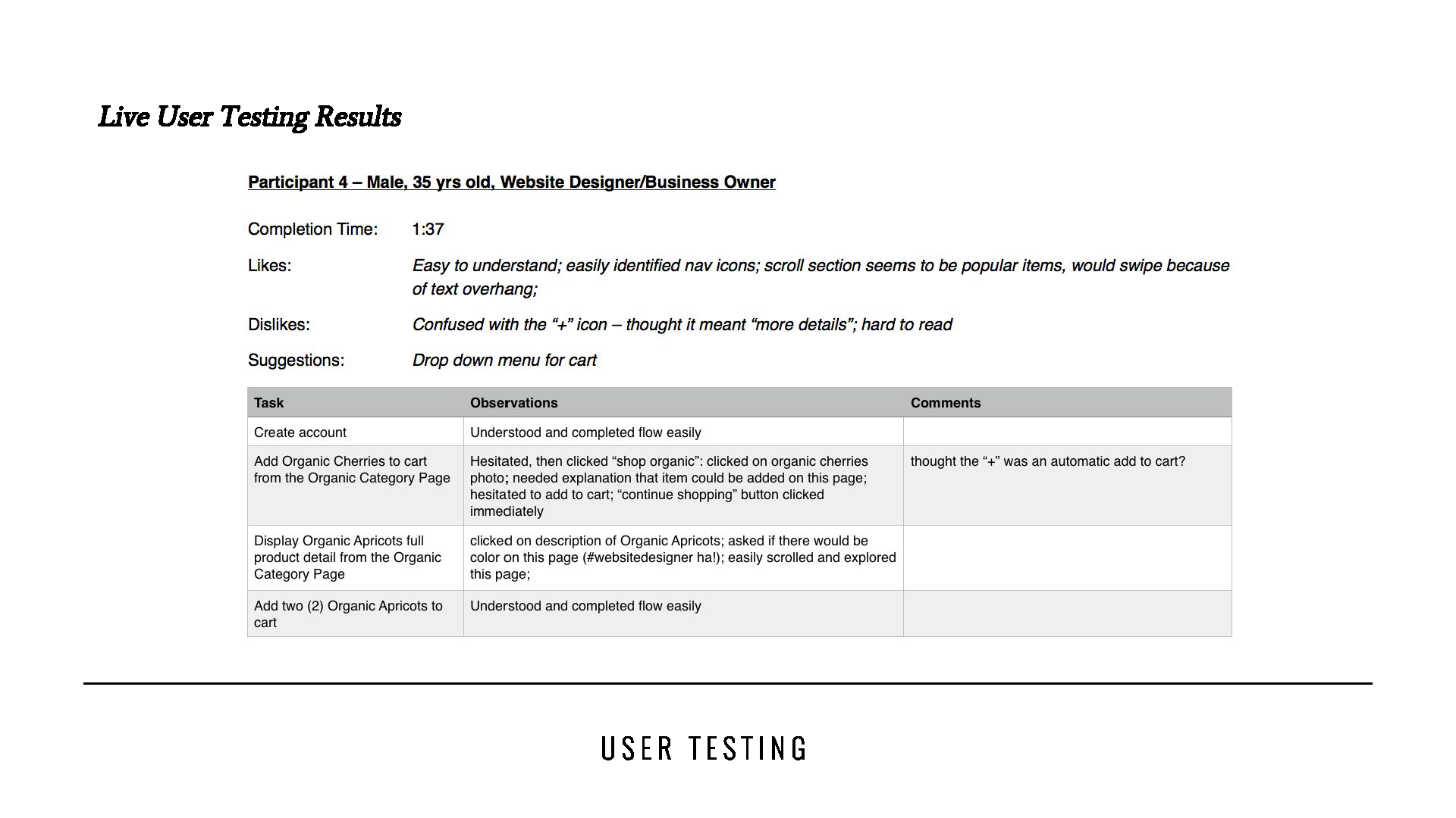
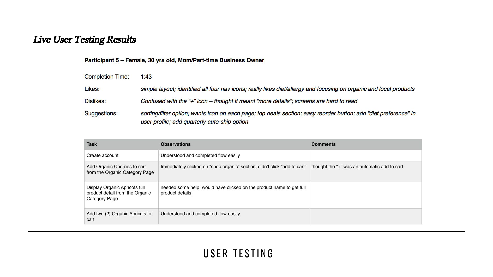
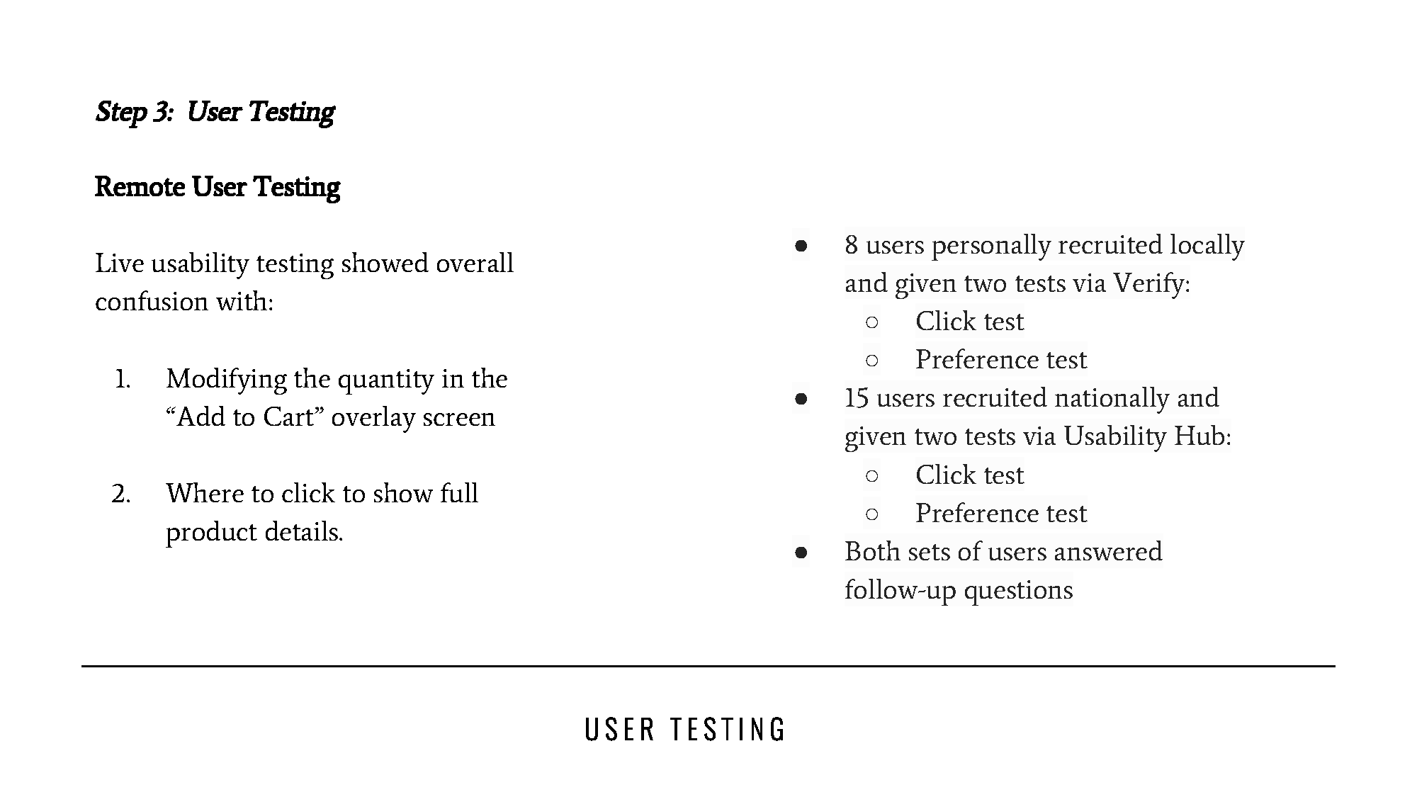
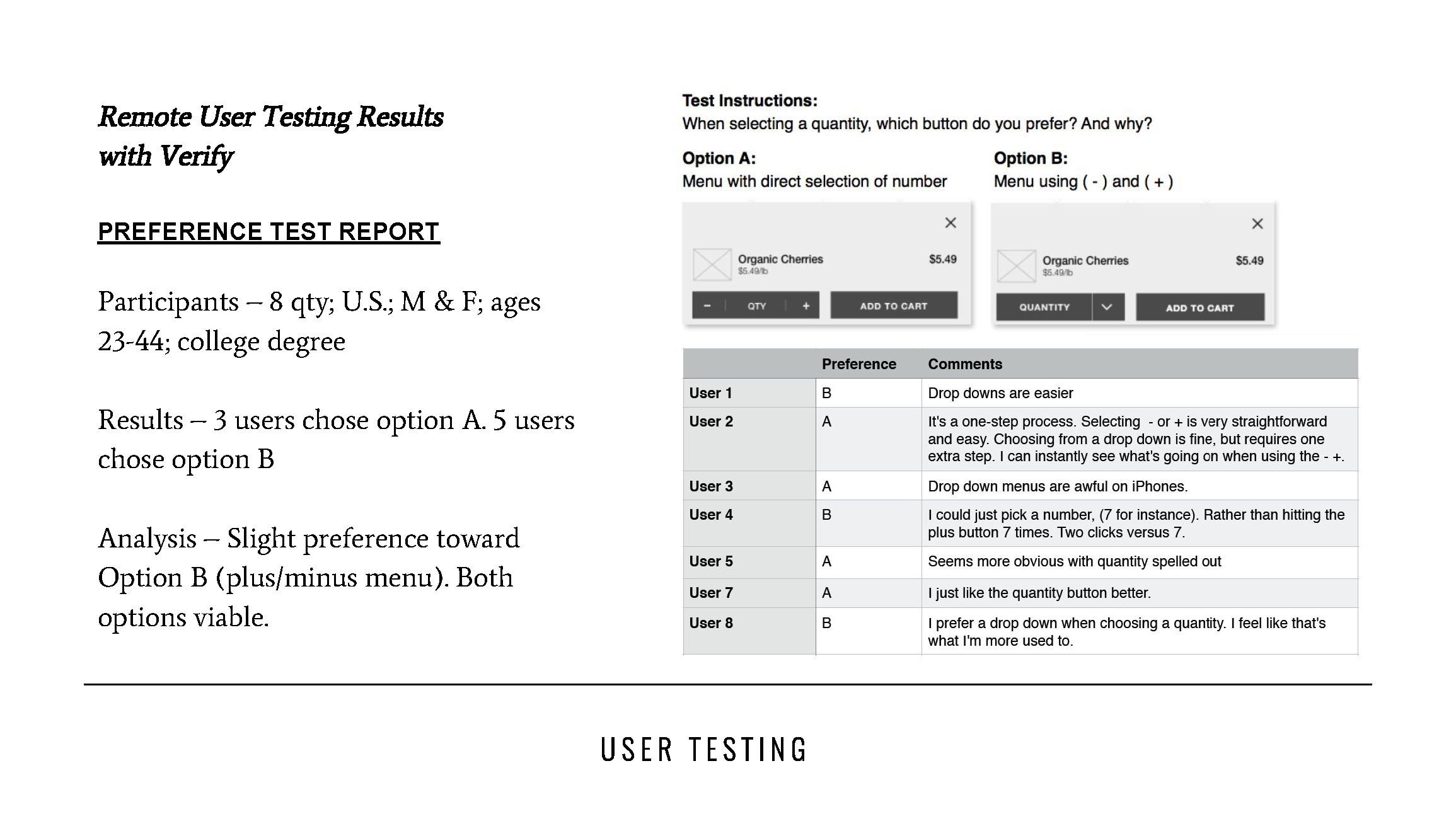
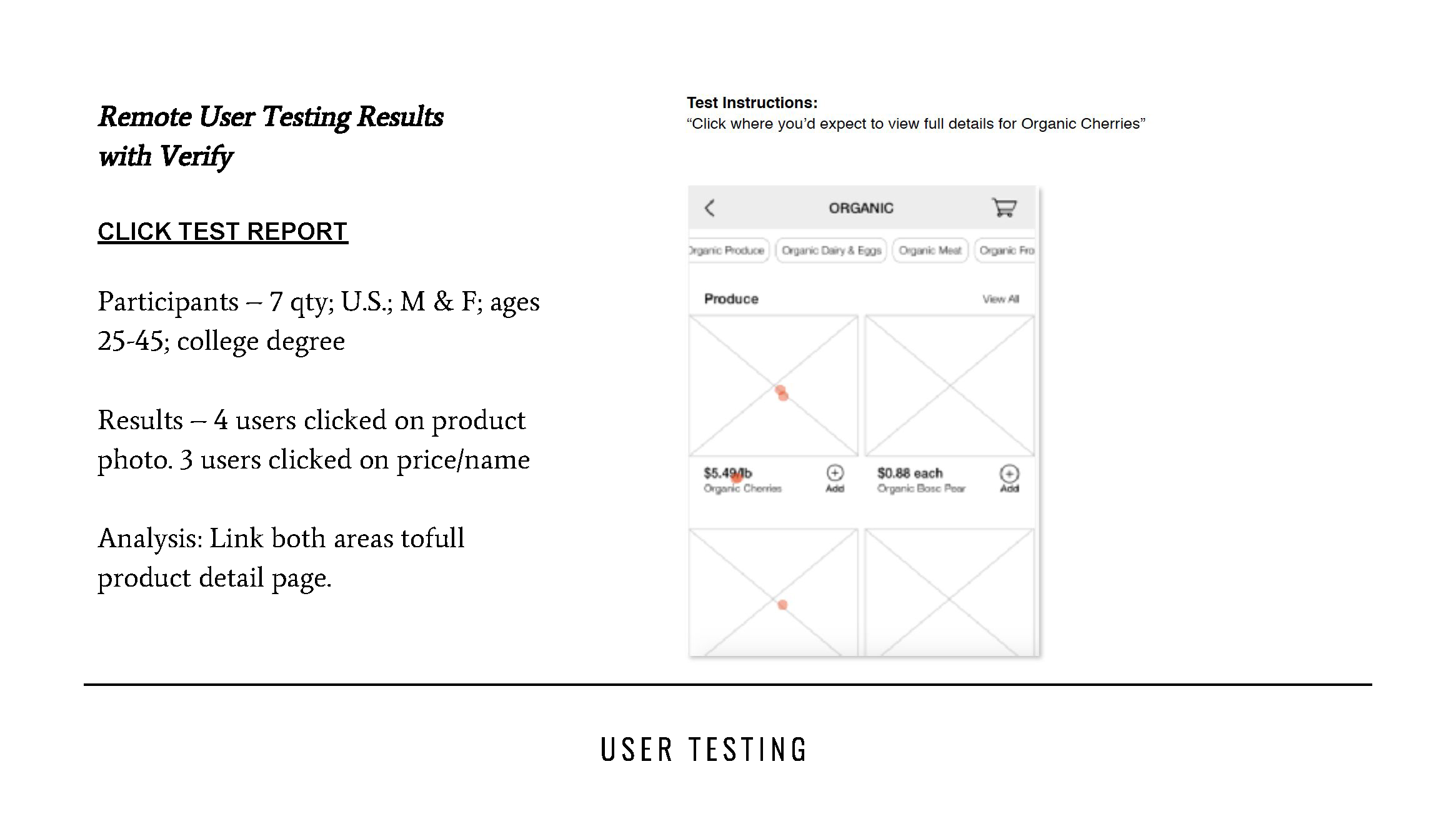
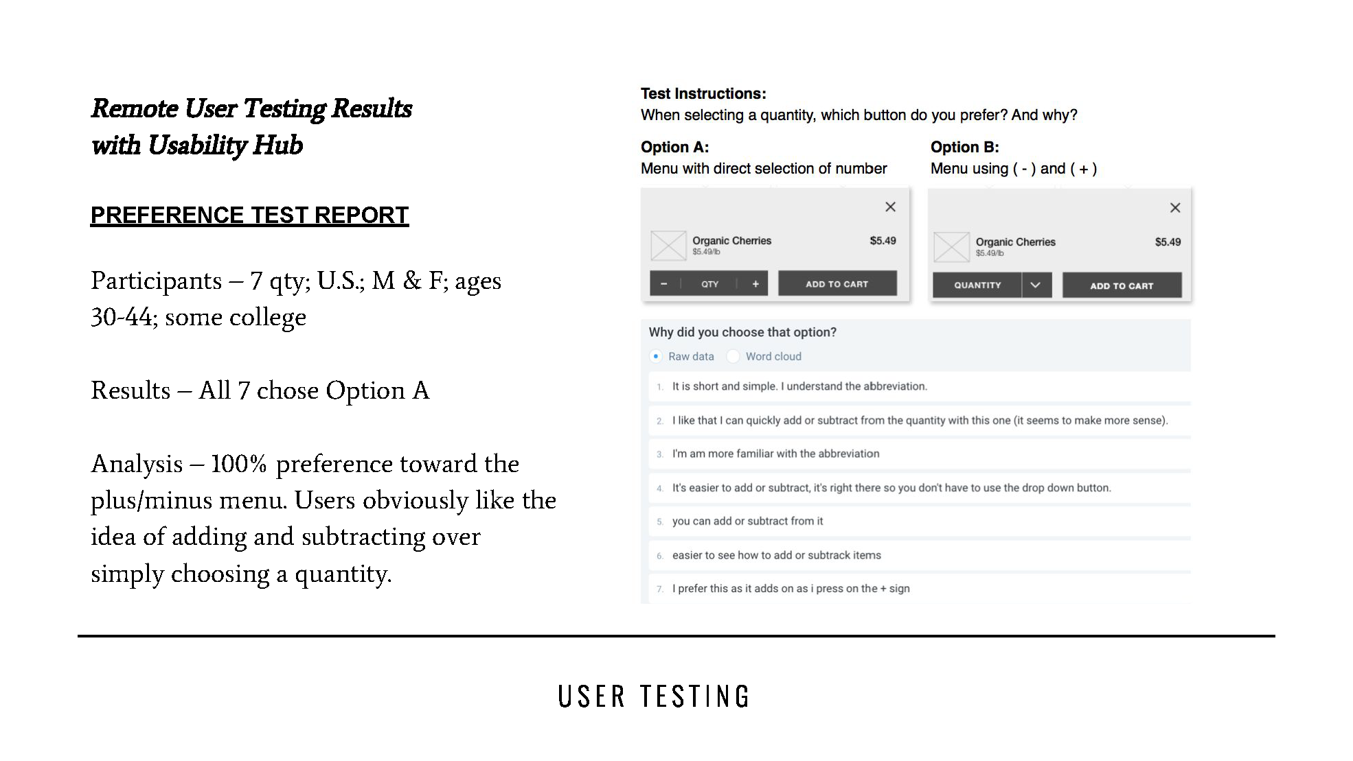
USER RESEARCH REPORT
Testing in an app format, I recruited five users from my target audience as I observed them perform four tasks. Aftwerwards, Verify and Usability Hub were implemented for A/B testing and click test reports.